Styles Background
Introduction
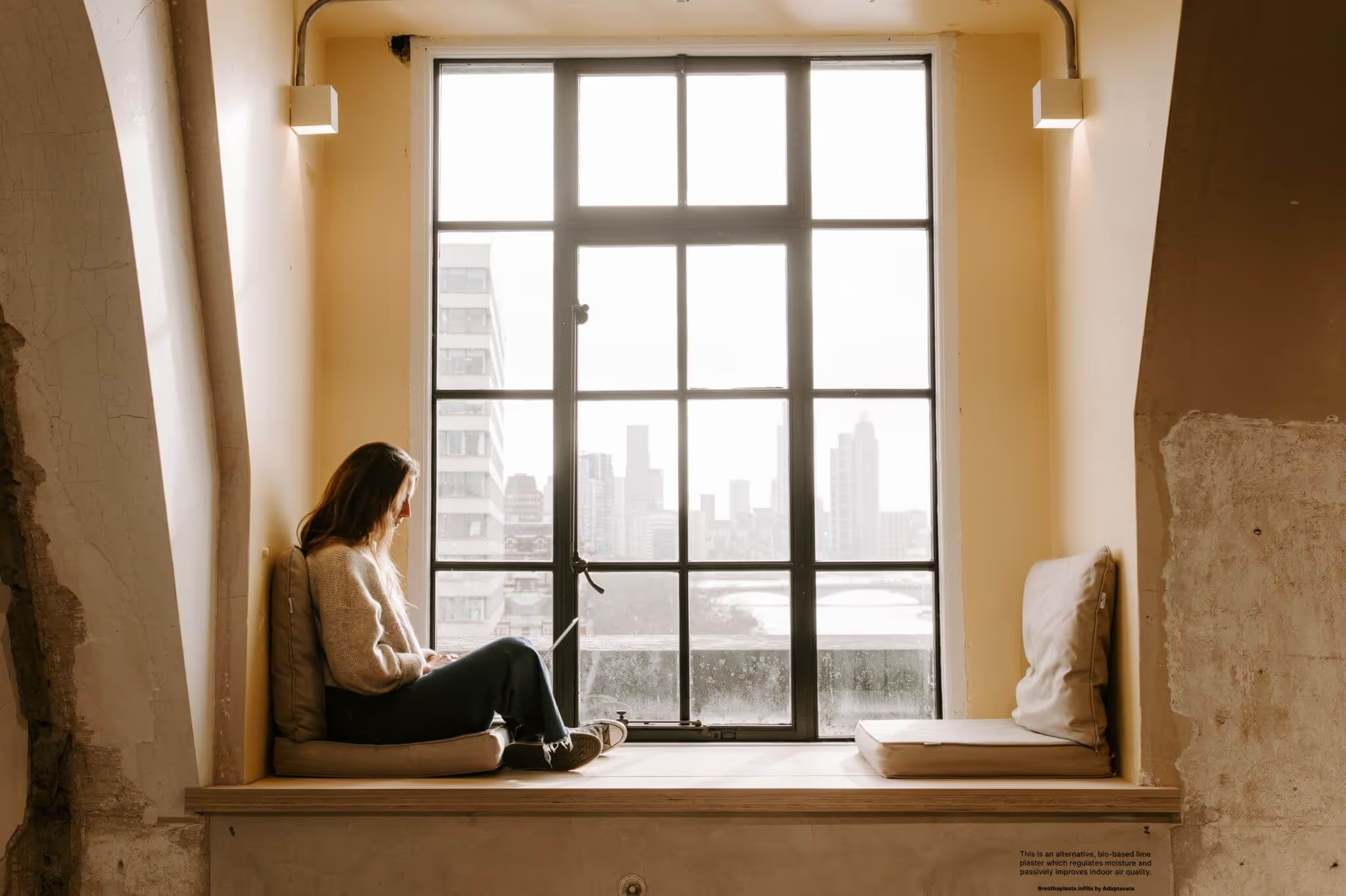
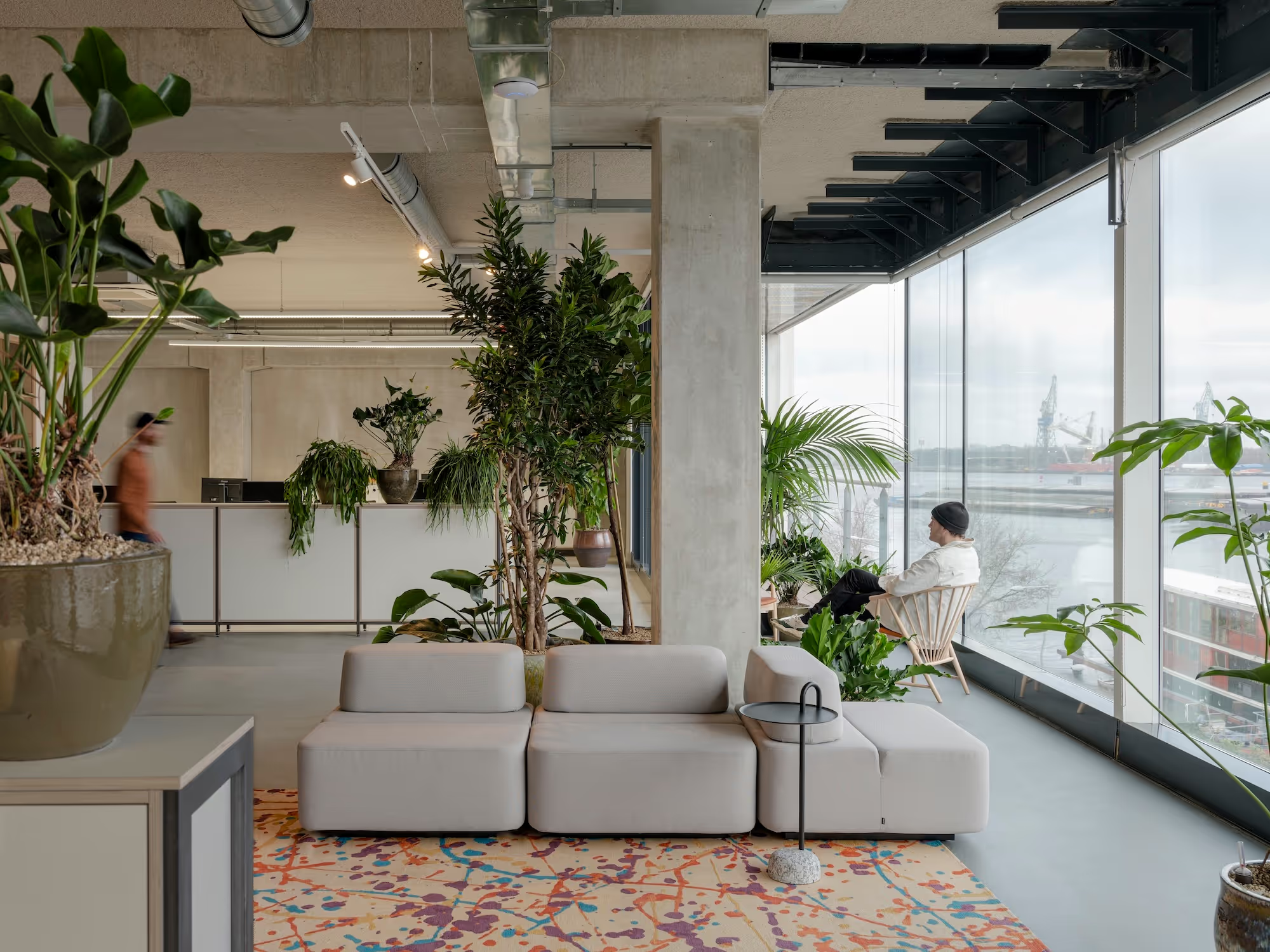
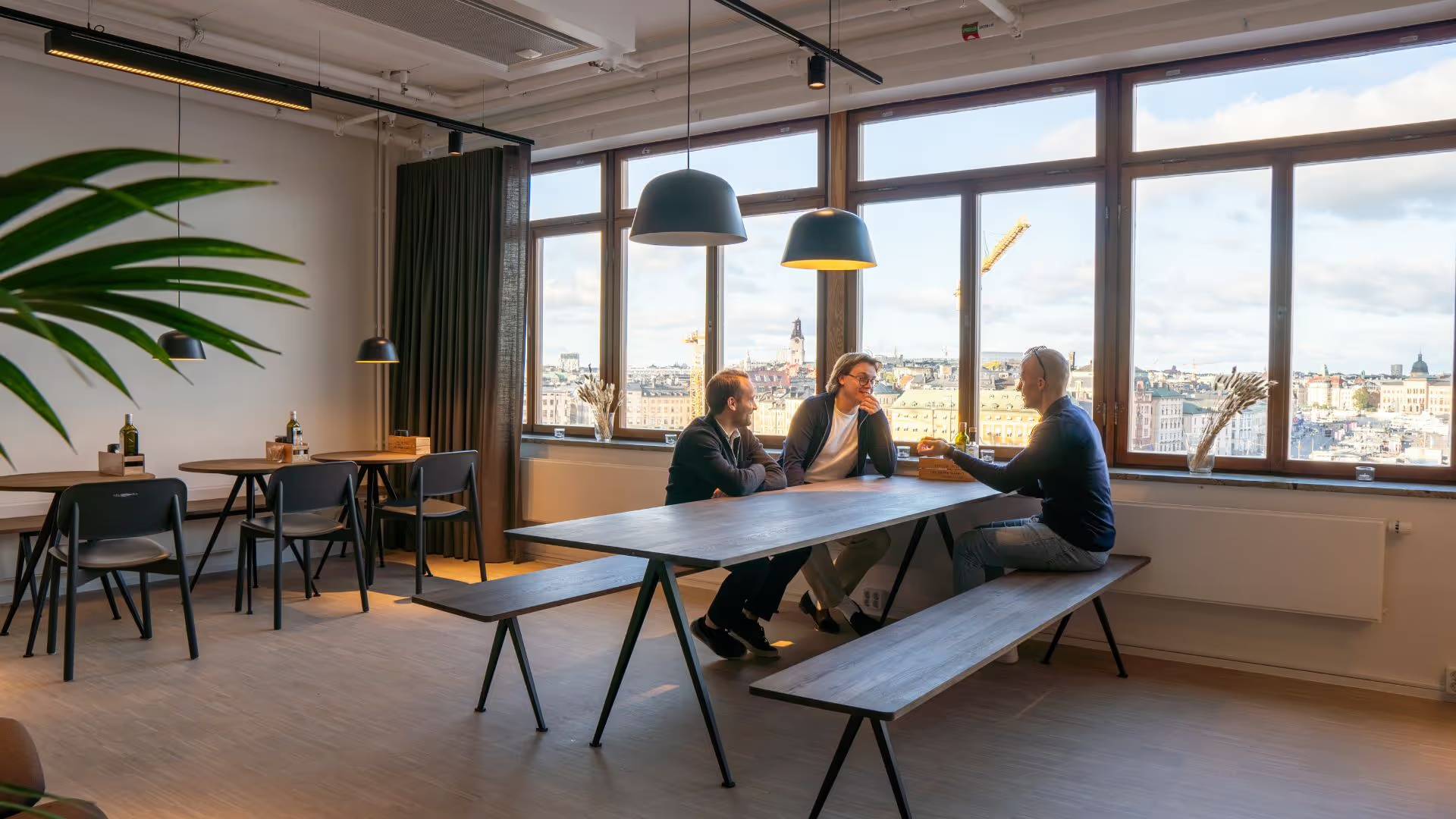
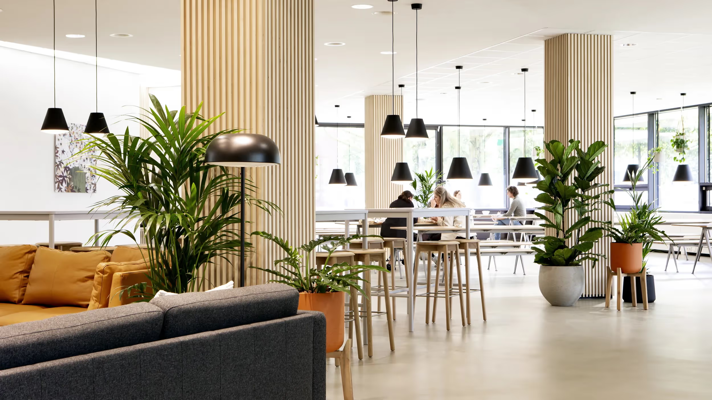
The diversity of nature and landscapes in the northern European countries was the starting point for the design aesthetic at NORNORM, captured in 3 Nordic look & feel expressions.
Essential is the simple high-quality design and the relationship between the materials and the more subtle colours. While embracing influences form many places in the world, we wish to stay connected to our Nordic roots.
Colour is an important place to start when defining any design style; acting as a backdrop for the rest of the design, and helps to cohesively bring separate elements together.
Our colour palette relies heavily on neutrals: most notably whites, naturals and tans, with accents of black to create sharp contrasts. It isn't completely devoid of colour, but overall the spaces tend to be more monochromatic, with different hues coming into play as accents. The colour palette is inspired by nature, and so colour choices are typically subdued, pastel shades with splashes of vivid and/or dark tones.
The interplay between quality of materials, simple shapes, clean lines and colours reflects who we are and the visual identity of NORNORM.
The Foundation
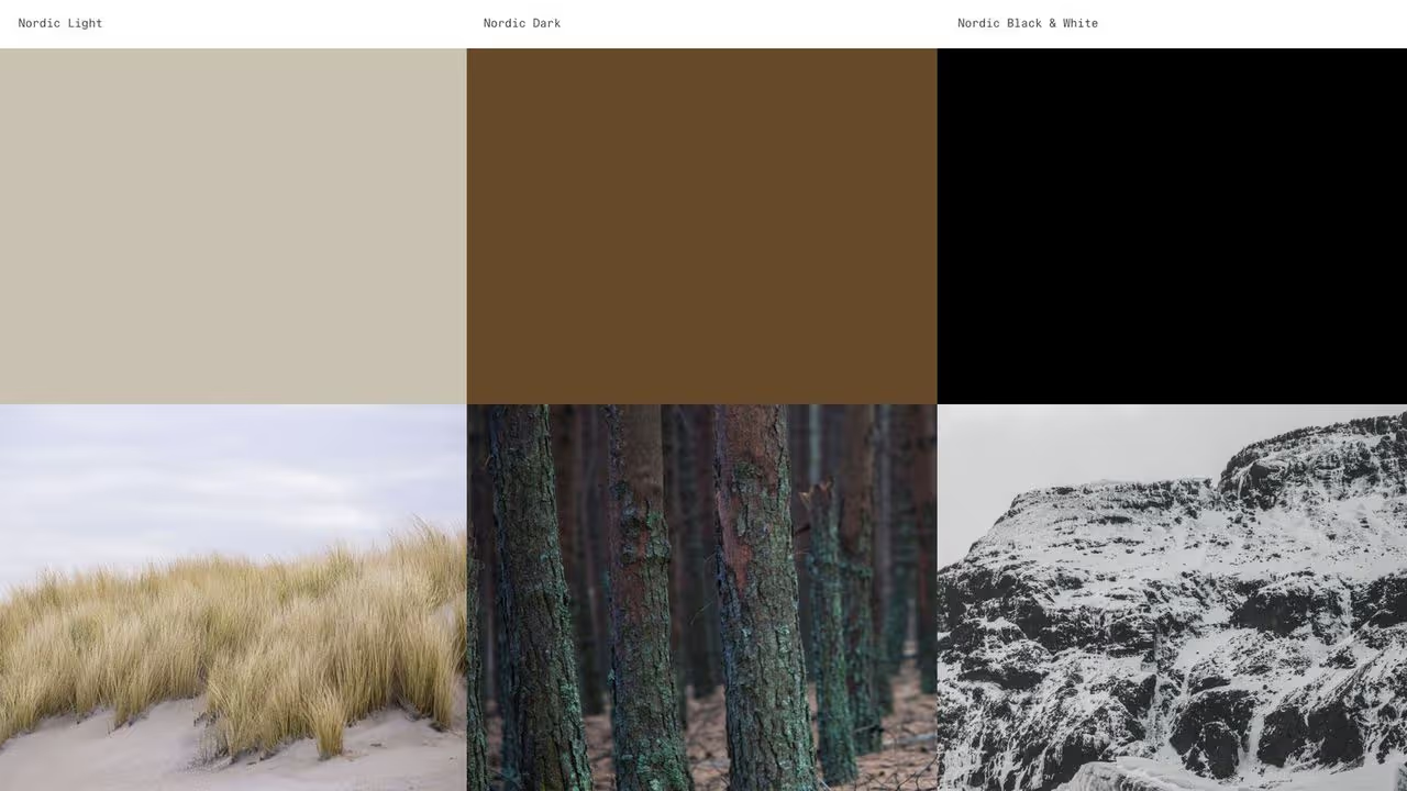
Nordic Light, Nordic Dark, and Nordic Black & White, are our three design styles.
They incorporate classic elements of the Scandinavian style, use plenty of natural materials, emphasise clean lines, and have a neutral colour palette. They are neither too minimal nor too cluttered, but are rather an uncomplicated mix of elements, with a focus on functionality and simplicity.
Not only timeless, the three design styles evoke a sense of calm and relaxation, stimulate creativity, well-being and cooperation, as well as spearheading the inspiring and beautiful workspace solutions we are creating at NORNORM.
